Exploratory Data Analysis (EDA) using State-of-the-Art (SOTA) Libraries
“Unleashing Insights from Data: Smart Data Visualization”

Exploratory Data Analysis (EDA) can be an intimidating task for many data science practitioners. With vast amount of data (many variables or features and rows) to analyze, it’s no wonder that many of us find ourselves feeling overwhelmed and unsure of where to begin. Sometime, It can be time-consuming and even frustrating. But with the latest libraries and tools available to us, we can navigate through the data with ease and uncover hidden insights that we might have missed otherwise.
In my experience, taking a human-centric approach to EDA has been the key to success. Rather than simply analyzing data, we can use the latest libraries to create stunning visualizations, spot patterns and trends, and even tell the story of the data. By approaching EDA as a creative and collaborative process, we can unlock hidden insights that might have gone unnoticed otherwise.
The latest libraries have revolutionized the way we approach EDA. They’ve made it possible to quickly and easily analyze complex data sets, perform statistical analysis, and even create interactive dashboards. By harnessing the power of these libraries, we can extract insights that can lead to breakthroughs in our work, from identifying new opportunities to optimizing processes and even predicting future outcomes.
Ultimately, EDA is about finding meaning in data. It’s about taking raw data and turning it into something that can inform decisions, inspire creativity, and even drive change. With the latest libraries and a human-centric approach, we can take on the challenge of EDA with confidence and excitement, knowing that we have the tools we need to unlock the true potential of our data.
Here I’m sharing my Five Favorite Libraries with you
- Plotly
- Pandas Profiling
- PyGwalker
- SweetViz
- D-Tale
Let’s Discuss these libraries one by one:
1. Plotly

Plotly is a data visualization library that allows users to create interactive charts, plots, and graphs in various programming languages, including Python, R, and JavaScript. With Plotly, you can create a wide range of visualizations, such as line charts, scatter plots, bar charts, heatmaps, and more.
Install Library:
! pip install plotlyImport Library:
import plotly.graph_objs as go
import plotly.express as px
Let’s take sample dataset here and generate some vizuals
# Load Dataset
df = pd.read_csv("income_data.csv", sep=';')

# Create a histogram of age, allowing you to see the distribution of ages in the dataset.
fig = px.scatter(df, x='age', y='income', color='gender')
fig.show()

#Scatter plot of income vs age with color representing gender:
fig = px.scatter(df, x='age', y='income', color='gender')
fig.show()

#Box plot of income by gender:
fig = px.box(df, x='gender', y='income')
fig.show()


These are just a few examples of the types of plots you can create using Plotly to explore your data. You can customize the plots further by adding titles, labels, and annotations as needed to better understand the patterns and relationships in your data.
2. Pandas Profiling:
Pandas profiling is a library that generates a report containing a summary of descriptive statistics and visualizations for each column in a pandas data frame. It provides a quick and easy way to get an overview of the data and identify potential issues, such as missing values or outliers.
Pandas profiling is a super easy to use python library that can be used to generate EDA profiling reports for your data.
How to use Python Profiling in Python
!pip install pandas-profiling   # install pandas-profiling

from pandas_profiling import ProfileReport

profile = ProfileReport(df, title='Example Data Profile Report', explorative=True)

profile.to_file('example_data_report.html')
In the above example, we first import the necessary Pandas and pandas profiling library modules, and load the dataset using pandas.
Next, we generate the pandas profiling report by passing the dataframe to the ProfileReport() function. This will create an interactive HTML report containing information on the number of observations, missing values, and descriptive statistics for each column, as well as histograms and correlation plots.
Finally, we save the report as an HTML file using the to_file() method.
Once the report is generated, you can open the HTML file in your web browser to view the report. The report will allow you to quickly identify any potential issues with the data, such as missing values or outliers, and gain insights into the relationships between different variables in the dataset.
You can also customize the report by specifying various options when calling the ProfileReport() function, such as excluding certain columns or changing the types of visualizations used in the report.
3. PyGwalker:
Stand for “Python binding of Graphic Walker”
PyGWalker combines the functionality of Jupyter Notebook (or other jupyter-based notebooks) with Graphic Walker, an open-source Tableau alternative. By enabling drag-and-drop operations, PyGWalker empowers data scientists to effortlessly examine and represent data patterns, without the need for intricate Python code.
Install PyGwalker
# Install library
!pip install pygwalker
Import Library and Use it
# Import libararies
import pandas as pd
import pygwalker as pyg

4. SweetViz :
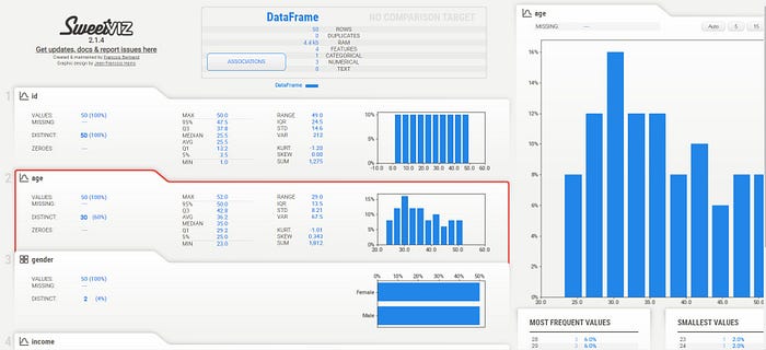
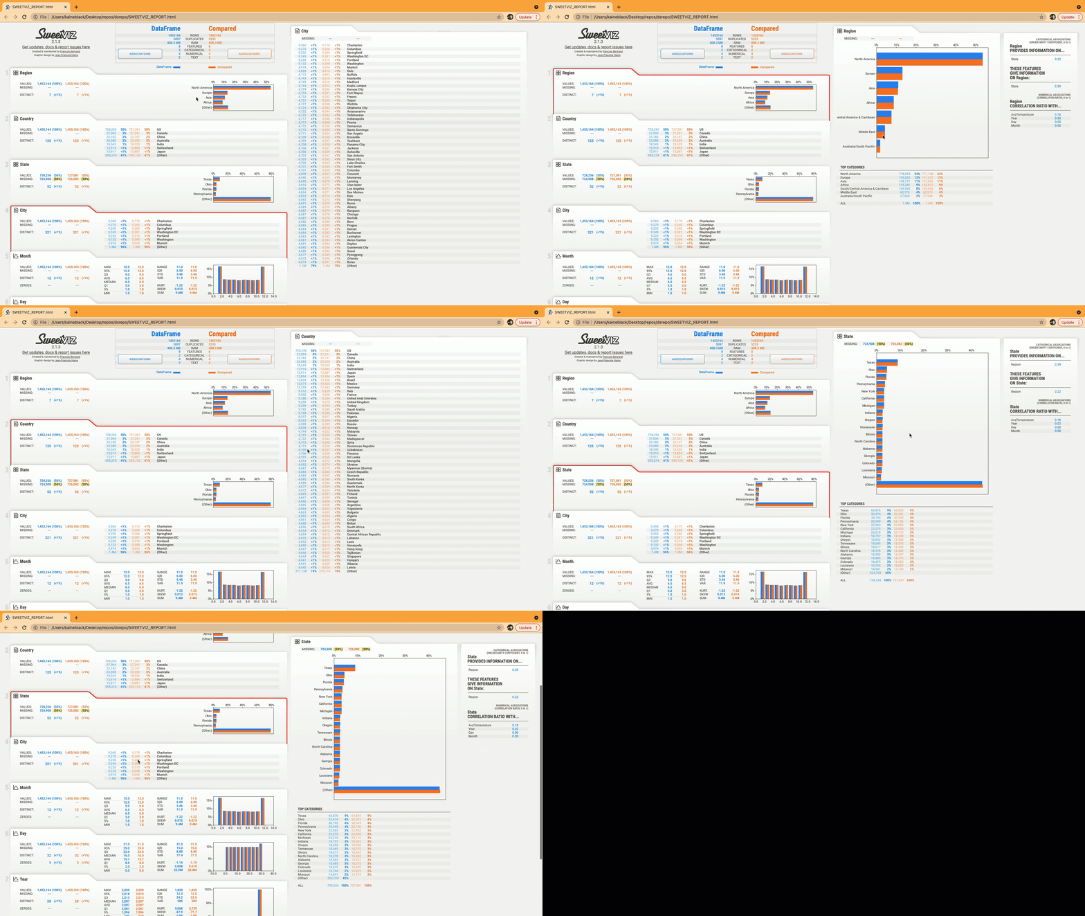
Sweetviz is a Python library for exploratory data analysis (EDA) that generates visual reports in HTML format. The library allows you to quickly visualize and analyze data, including basic statistics, distributions, and relationships between variables.
Install Library :
# Install Sweetviz library
!pip install sweetviz
Import and Use Library :
# Improt libraries
import sweetviz as sv


5. D-Tale:
D-Tale is an open-source python auto-visualization library. It is one of the best auto data-visualization libraries. D-Tale helps you to get a detailed EDA of the data. It also has a feature of code export, for every plot or analysis in the report.
Install Library :
!pip install dtaleImport and Use Library :
import dtale
import pandas as pd

dtale.show(pd.read_csv("titanic.csv"))
Conclusion:
In conclusion, the choice of python libraries for exploratory data analysis (EDA) depends on your skill level and requirements. If you are a beginner, it is best to start with the pandas library and writing python code to acquire fundamental knowledge and programming practices. However, for more advanced users, self-defined functions that use a combination of libraries like NumPy, Matplotlib, Seaborn, and Pandas can be very helpful in speeding up EDA work.
Amongst the libraries discussed, Plotly and DTale are standout tools for auto-visualization of data, as they provide comprehensive EDA with custom filters and the unique feature of code export. These libraries can help you generate insightful visualizations that aid in data analysis, making them a valuable addition to any data analyst’s toolkit.
